Name

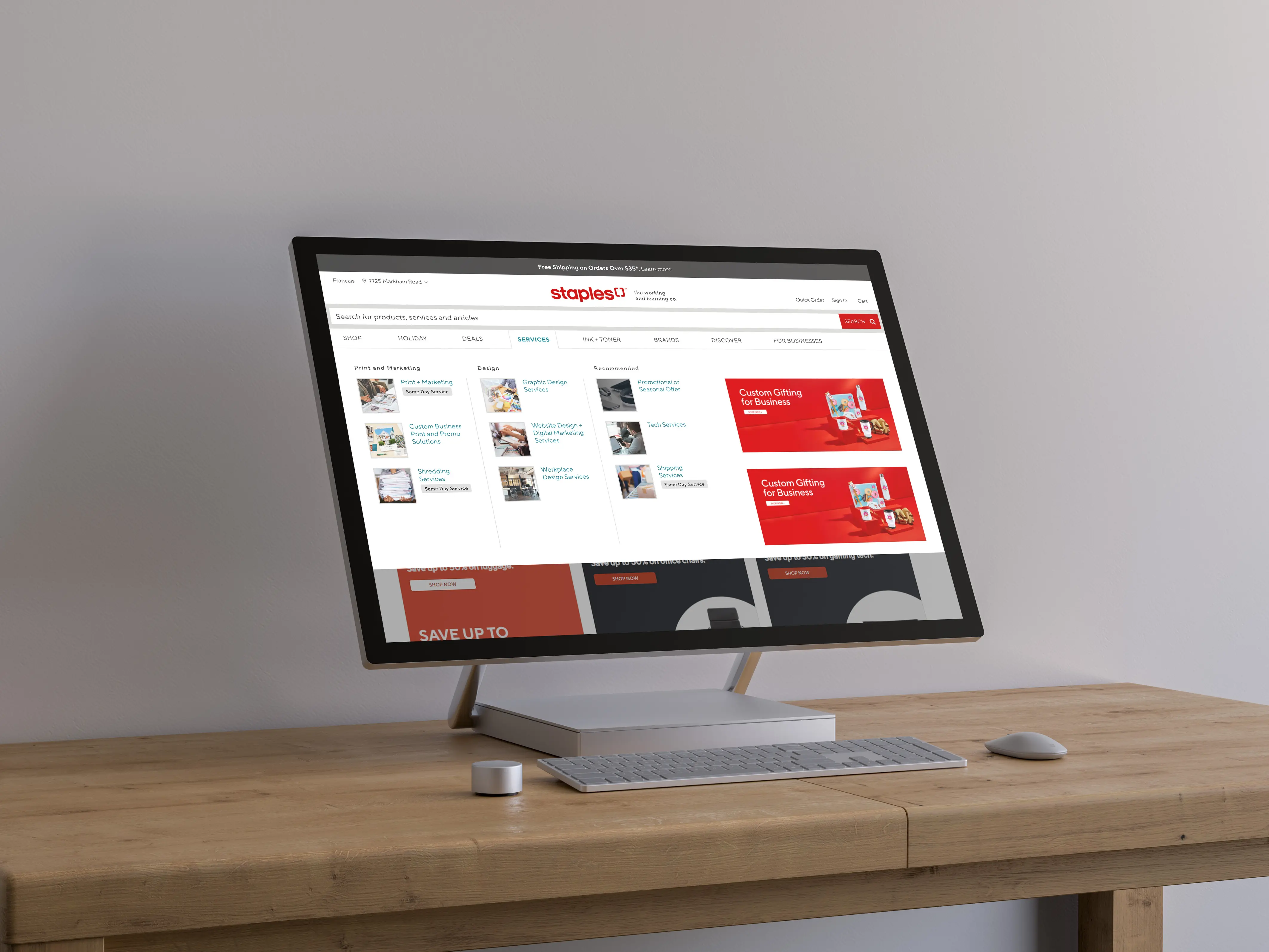
Staples Services Nav Menu

Ecommerce Navigation

2023

Logo
Logo

Project Overview

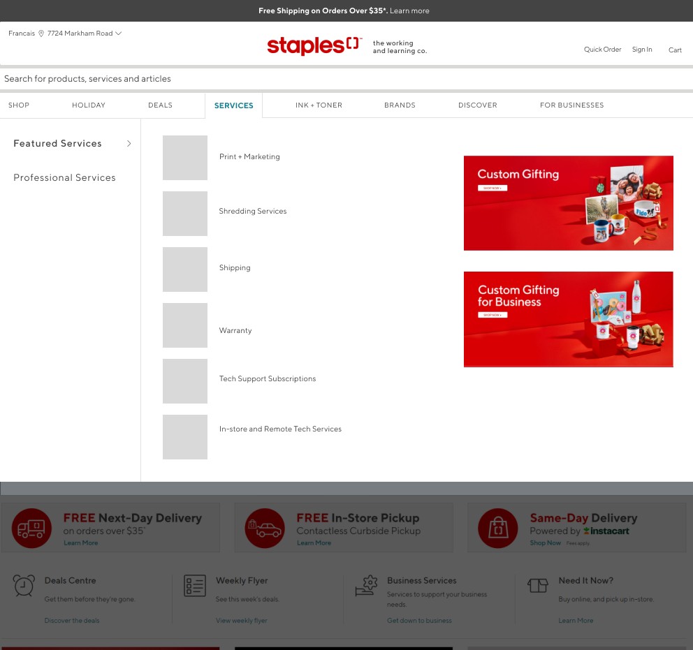
Staples provides an extensive range of services that range from basic paper shredding to comprehensive design collaboration. However, the current user experience is overcrowded and unclear, making it difficult to distinguish between the different services.

Role: Product Designer, UX Researcher
Responsibilities: User Research, Wireframing

Problem

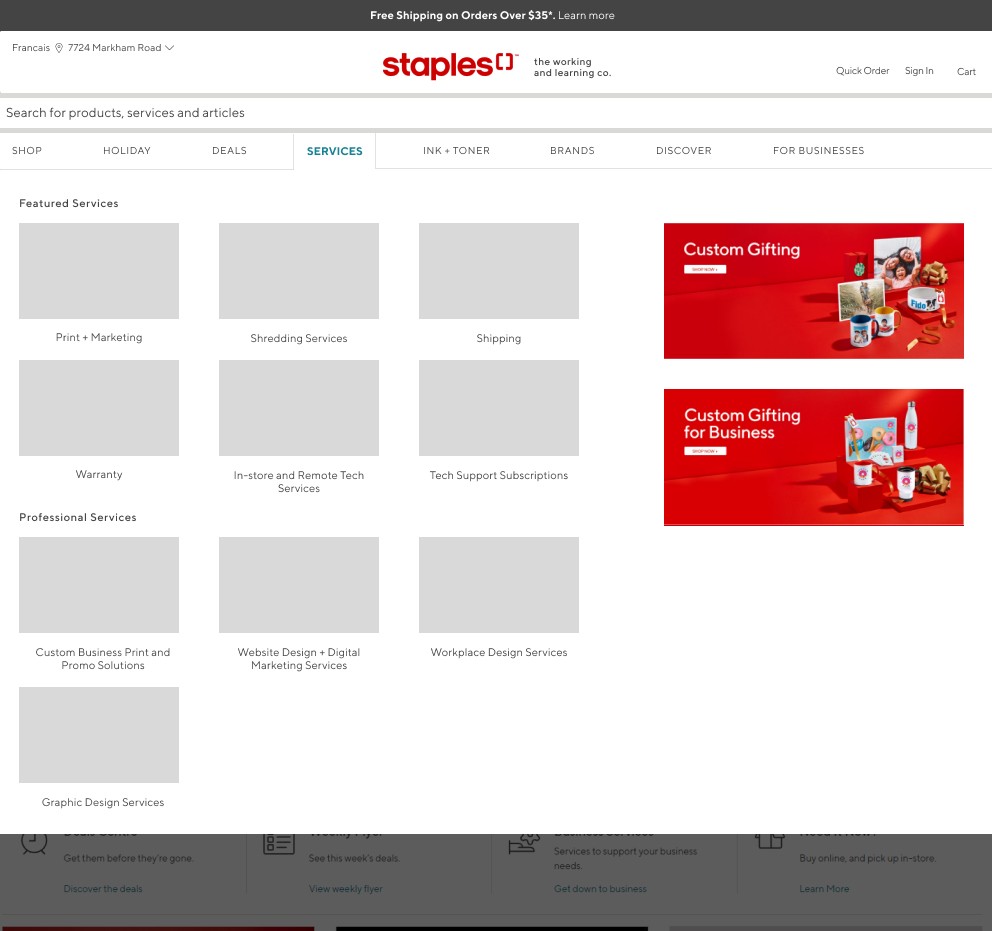
With the Staples’s rebrand 2019, many services and tech solutions were offered to support a wide variety of businesses and customers. This created a new problem with flooding the services dropdown with similar sounding services that were intended for different customer needs.

Goals

Increase clarity and context in the Services dropdown section while adhering to the business' goals and development constraints. Conduct research and present findings and improved designs to stakeholder's.

Project Discovery

Our CEO was navigating the site and found the Services section incredibly hard to navigate. He sent a note to the marketing team, who subsequently ran reports to understand the metrics on click through rate per service. After collecting metrics, they tasked the UX team to find a solution.

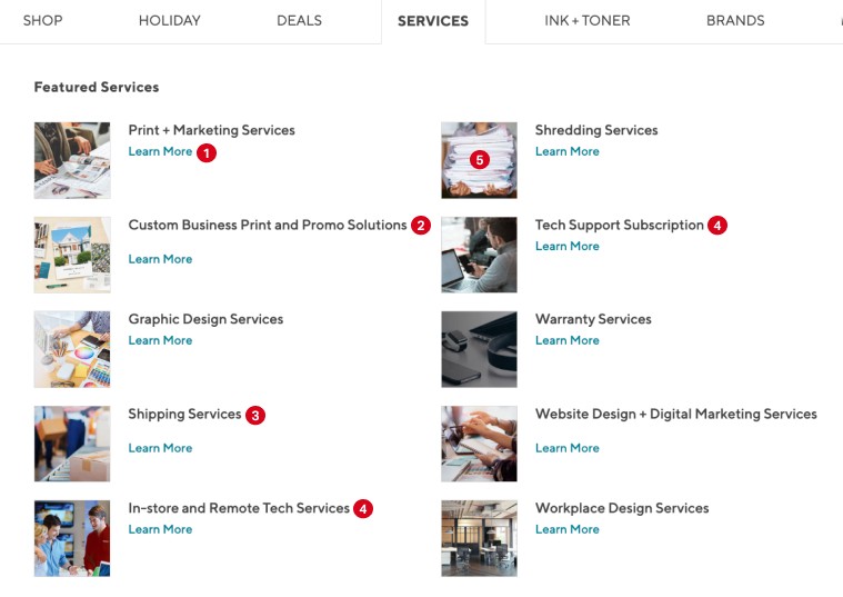
The initial scope of the project was to conduct user research to better understand why some services had low CTR and why others had high CTR but low conversion. Prior to research, Morgane and I had a couple of assumptions as to why there was less engagement with majority of the services:

1

Learn More verbiage is excessively used, and the space could be utilized to better describe services.

2

Service naming tends to be unclear what exactly it offers and should be more concise.

3

The items in the dropdown are not categorized or organized by category.

4

Services with similar names create confusion for customers, making it difficult to determine which option they should select.

5

The photos and icons utilized are ambiguous and do not provide additional information regarding the specifics of the service.

Research Phase

We identified that customers were not engaging with parts of the service tab due to two key reasons:

  1. Customers do not understand or are not attracted to the names of the services (Information Architecture)

  2. The titles of the services are not noticeable (User Interface)

Tree Testing

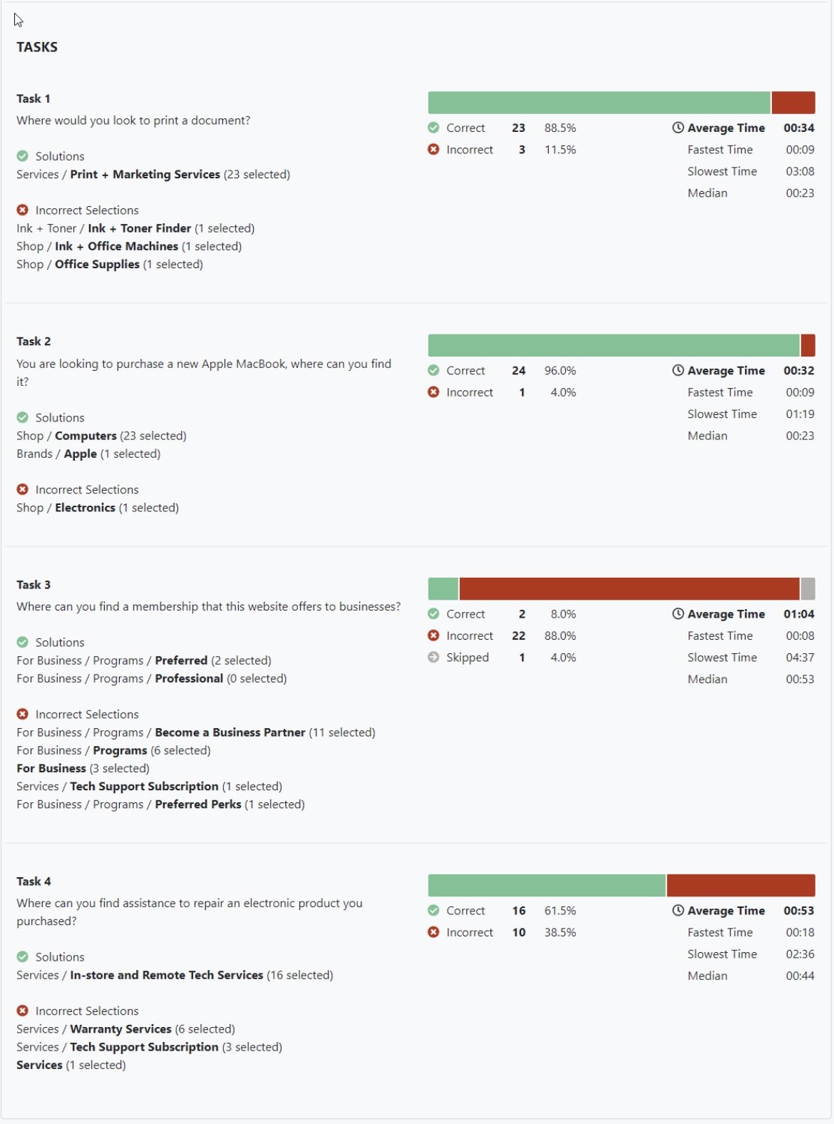
We had users via UserTesting complete tasks (e.g. repair an electronic product) and found that customers were able to correctly identify the L1 (i.e Services). However, within this area, customers had some inconsistency with which service would best relate. Users were unsure about what some of the services had on the pages based on their names. Therefore, we wanted to test if the names of the services were not clear enough to users and if there was a better name for these pages.

Page Naming Test

In the following test, participants were given descriptions of the pages and asked to provide a name. We had consistent naming by participant compared to the current names of the following services: Shipping, Warranty, Shredding. For some of the other titles, there was no clear consensus on what the title of those pages should be with only one or two participants indicate names similar to the ones that exist. Most noteably, for the Graphic Design Services page, participants associated it with brand development for businesses based on the description of what was on the page.

Card Sorting

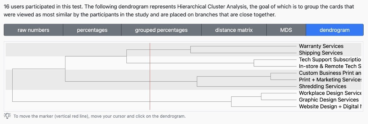
During our final test, we provided participants with the current names of services on cards and requested them to categorize them appropriately. We then collected and analyzed the data, resulting in the following findings:

Technology Services: Tech Support Subscription, In-store and Remote tech services, Warranty services (however, warranty may apply to things outside of electronics)


Print + Marketing Services: Print + Marketing Services, Custom Business Print and Promo Solutions, Shredding Services (with the customers saying this is more closely related to physical print)


Design Services: Graphic Design Services, Website Design + Digital Marketing Services, Workplace Design Services.

We found that shipping Services was an outlier and was not grouped in any significant categories with other services.

We had collected substantial research and evidence to approach the team with our idea to improving the experience of the dropdown section. In the redesign meeting, we proposed to rename the categories and asked if each respective service team would be able to consider improving the content on the pages after the design is presented in the following weeks.

Design Iterations and Stakeholder Suggestions

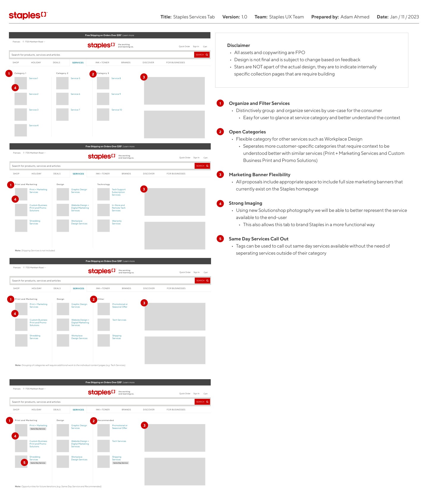
With the user research in mind, I created various lo-fi mockups to present to the team in our design critique. To stay within scope, the redesign aligned with existing development practices and used formatting and elements existing in navigational components and the developing design system.

  • Proposal 1 adhered to the current structure of the live site, with services restructured into two categories - one for professionals and another for the majority of customers.

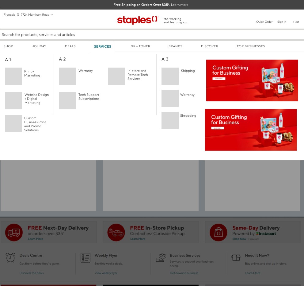
  • Proposal 2 was based on the categories that we discovered through our UserTesting research, and it remains a viable option for development as it incorporates a slightly modified version of the Shop dropdown design.

  • Proposal 3 took into consideration the development time and resources by utilizing the existing Shop dropdown navigation. However, it does require more steps to locate professional services.

Following the design critique, I presented our findings and suggestions to our B2B stakeholders for approval.

Final Design

I facilitated user testing with a small group, addressing inquiries on functionality, app features, sorting, and the Profile section, among other aspects. Analyzing the feedback and results, I successfully formulated an improved user flow, paving the way for the next phase of mockups and prototyping.

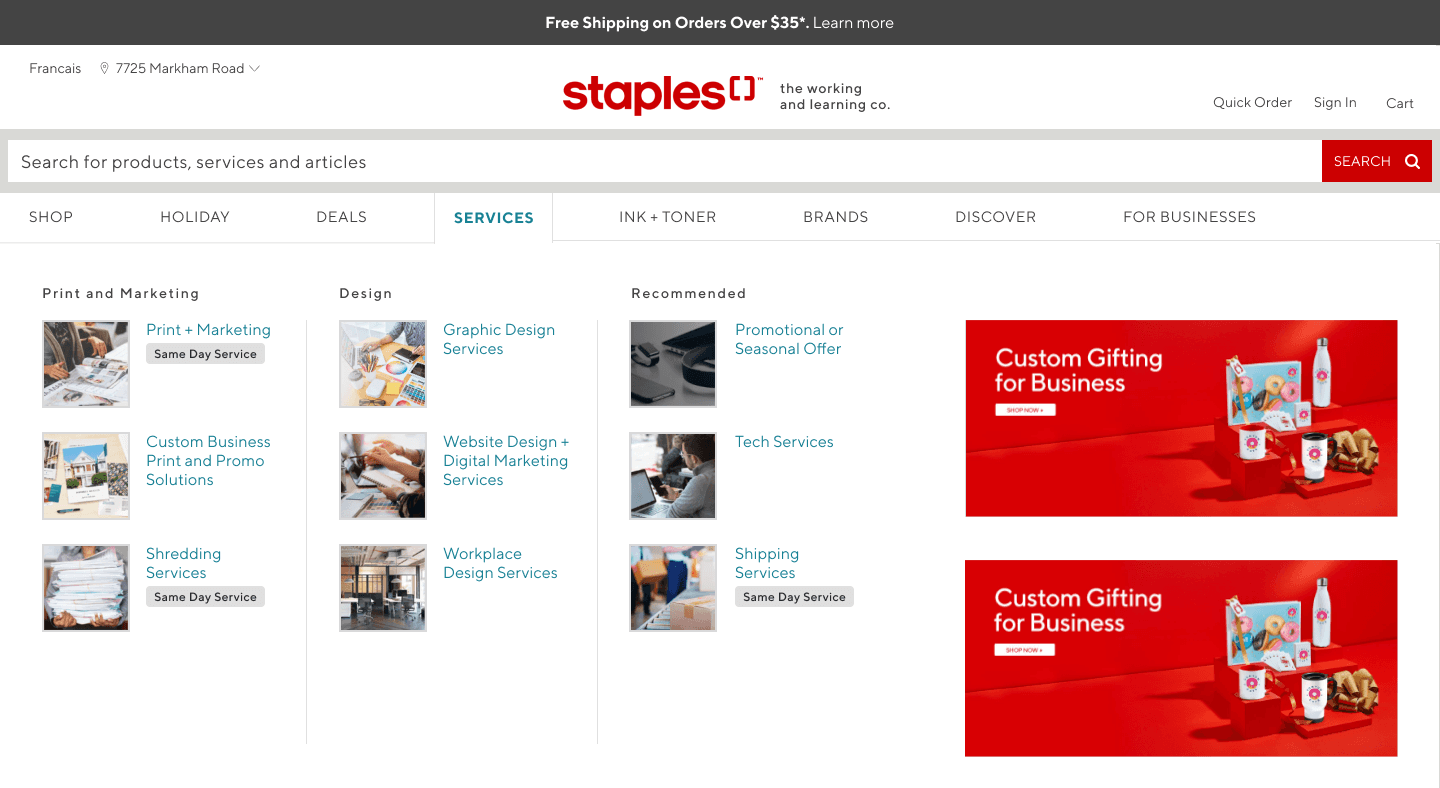
After receiving feedback from the team and having the second design approved, I refined the design by creating several iterations that incorporated various category terminologies and CTA options as requested by the marketing team. Prior to development, the final design involved streamlining the layout and restructuring the services into three distinct categories.

Conclusion

Within the project scope, the redesign successfully meets the needs of improving the service clarity while staying within reasonable development resources.

Key Takeaways

Business Prioritization

  • It's more important to design with the current business' infrastructure in mind then to attempt to rework it

  • In future projects similar to this, I would start the research phase by researching multiple stakeholder's earlier in the process

Development Constraints

  • Understanding the developer's bandwidth early on is extremely important to better align proposed designs

  • I was able to design with the developer's in mind, but in the future, I would find out exactly what was capable in a sprint prior to designing.

Planning Research Phases

  • Creating a defined research plan prior is important to keep the business' costs as low as possible

  • Being tasked this challenge at a high-level, we continued to learn in a non-linear path as we conducted research. In the future, I would set more guidelines prior to the research phase.

Whenever, wherever. We're meant to work together.

Get in touch with me for full-time job opportunities, freelance projects, design advice, or simply to say hello.

Designed by

12:04:49 AM

Whenever, wherever. We're meant to work together.

Get in touch with me for full-time job opportunities, freelance projects, design advice, or simply to say hello.

Designed by

12:04:49 AM

Whenever, wherever. We're meant to work together.

Get in touch with me for full-time job opportunities, freelance projects, design advice, or simply to say hello.

Designed by

12:04:49 AM